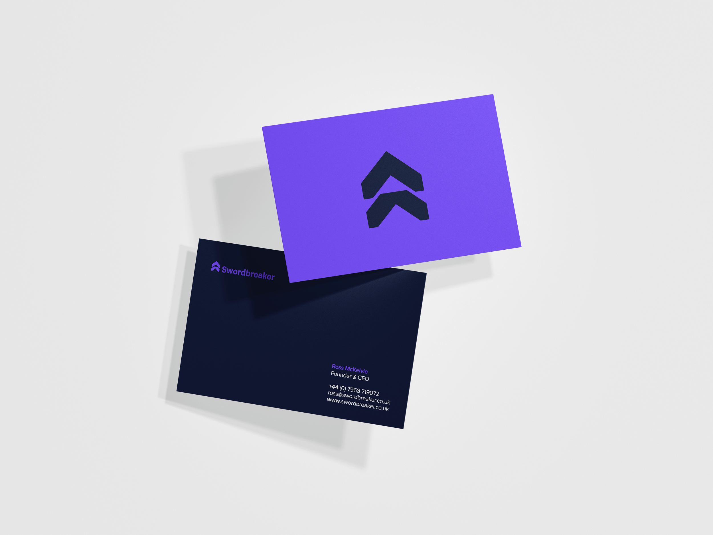
Brief: Swordbreaker is a cybersecurity startup focused on protecting organisations against ransomware attacks. As a new business entering a competitive market, they needed a distinctive brand identity to build credibility, communicate trust, and reflect their innovative approach to cybersecurity.
Approach: The project began with a mood board to establish the brand’s visual direction, followed by three distinct identity concepts. Rather than a literal sword illustration, I developed a modern geometric symbol inspired by the distinctive profile of the Swordbreaker blade. The upward forms were intentionally chosen to convey progress, resilience and forward thinking, reflecting Swordbreaker’s proactive approach to cybersecurity. That visual language carries through the wider identity, with supporting brand elements echoing the same angular forms to create a cohesive and recognisable system.
Outcome: The final identity gives Swordbreaker a distinctive, professional presence that reflects its innovative approach to ransomware protection. The branding communicates trust and intelligence, while providing a flexible system that can grow with the company’s products and services.

Logo: Rather than creating a literal representation of a sword, the logo uses a modern geometric symbol inspired by the distinctive profile of a Swordbreaker’s blade. Its upward-facing forms represent progress, resilience and forward thinking, reflecting Swordbreaker’s proactive approach to cybersecurity. The symbol works both as part of the full wordmark and as a standalone brand mark, giving the identity flexibility across different applications while maintaining a strong, recognisable visual presence.
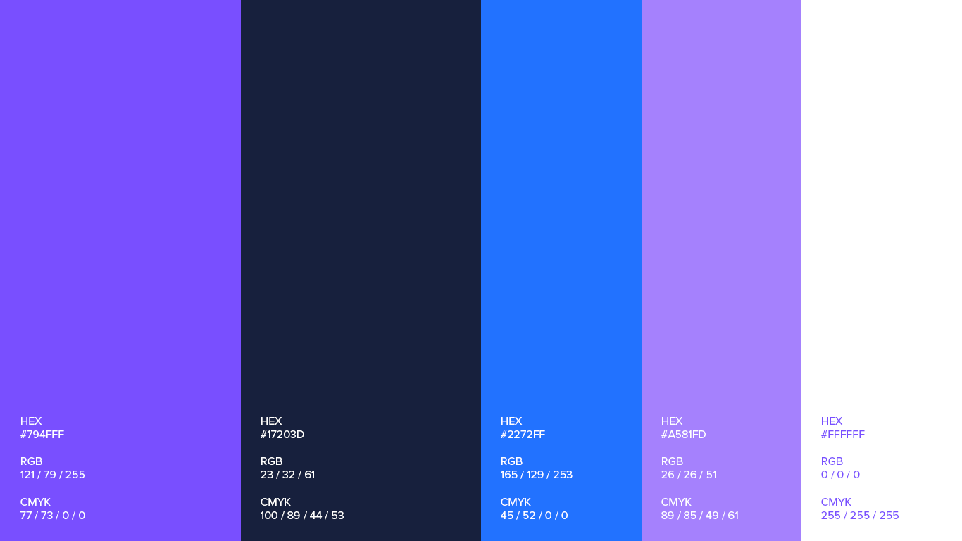



Colour Palette: The colour palette was designed to feel confident, modern and distinctive, while moving away from the more expected visual language of cybersecurity. Red was deliberately avoided due to its associations with danger and the more literal connotations of blood linked to the Swordbreaker name. Instead, deep navy, vibrant blue and electric purples create a balance of trust, technology and energy. Blue brings a sense of security and reliability, while purple adds innovation, intelligence and a forward-thinking edge, giving Swordbreaker a bold identity that stands apart from its competitors.
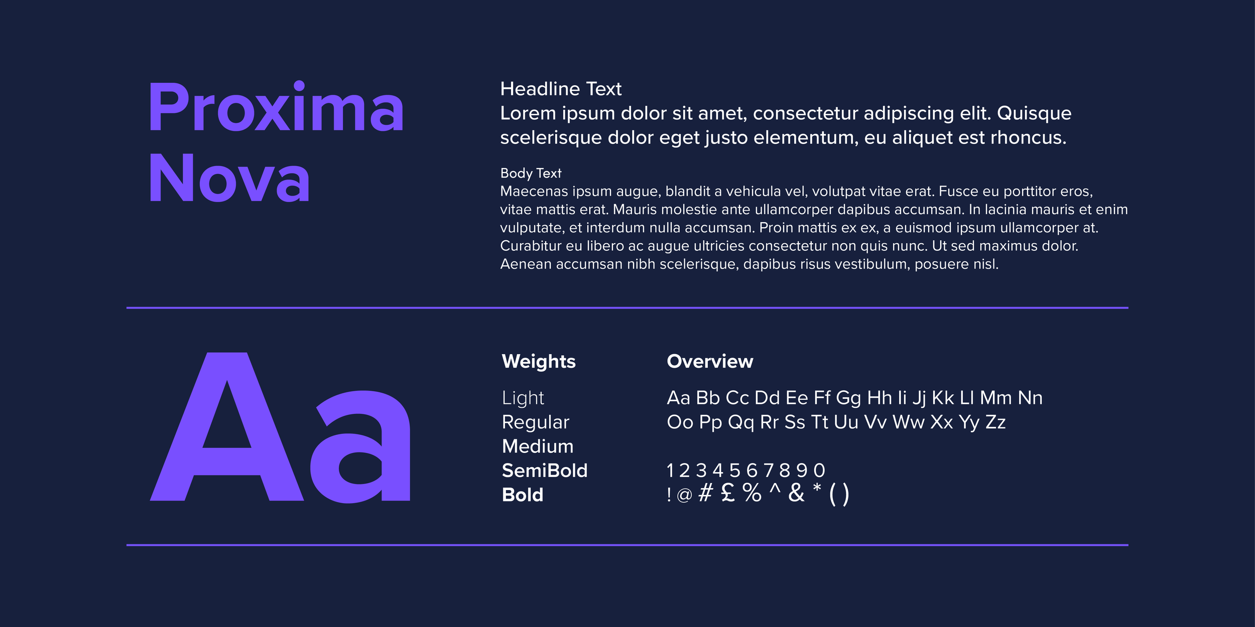
Typography: Proxima Nova was chosen as the brand’s main typeface, providing a clean, modern and highly legible foundation across all communications. Its simple geometric forms complement the more distinctive primary typeface, creating a balanced and versatile typographic system that works across both print and digital.

Brand Imagery: As Swordbreaker is a digital first brand without a physical product, the imagery was kept abstract, with subtle technological and computer inspired elements. Using the brand colour palette throughout, the imagery adds visual interest while reinforcing the modern, digital feel of the brand, while the abstract approach allows it to work seamlessly across both print and digital applications.