
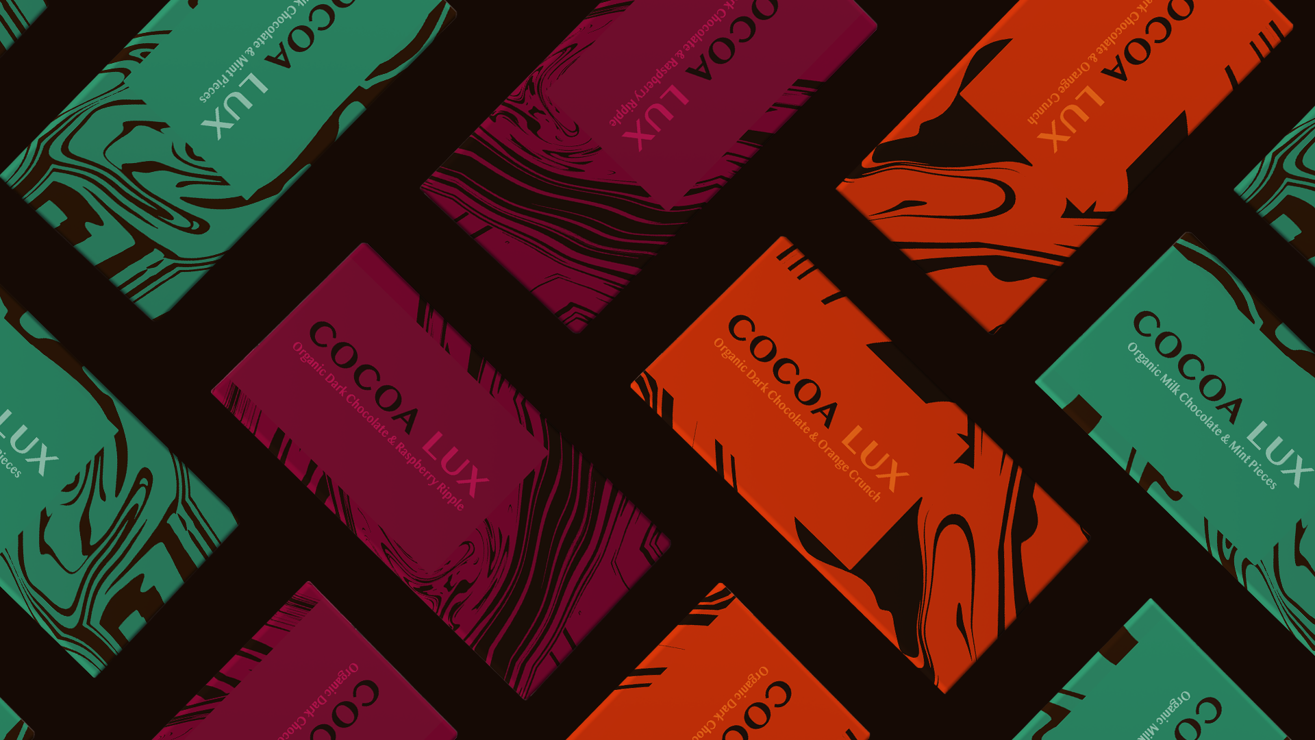
Brief: To develop a bold, contemporary brand identity and packaging system for Cocoa Lux, a premium organic chocolate brand designed to appeal to a younger, design-conscious audience. The brand needed to balance indulgence and luxury with energy and personality, creating a distinctive presence within a crowded market.
Approach: A refined serif typeface was selected to give the woodmark a contemporary yet sophisticated feel, balancing timeless elegance with modern appeal. Developing an abstract visual language inspired by the fluid movement of melted chocolate, using organic, flowing forms to create a distinctive pattern system across the packaging, creating a different abstract pattern for each flavour to avoid repetition. Each flavour is brought to life through a bold colour palette, with the colour associated to each flavour appearing to ripple through the chocolate — creating a visual connection between the product and its ingredients without relying on literal imagery.
Outcome: The final packaging system delivered a bold visual identity across three core chocolate varieties, with each flavour distinguished by a distinctive colour flowing through an abstract melted chocolate pattern. The result is a cohesive, scalable look that communicates premium quality without relying on traditional luxury cues. A flexible framework has been created for future flavours or limited editions.

Logo: Set in Sinhala MN, a serif typeface featuring clean, balanced letterforms and well-defined strokes, the all-caps wordmark creates a refined, contemporary identity. Its understated simplicity provides a visual counterpoint to the fluid, expressive packaging patterns, allowing the two elements to work together without competing for attention.
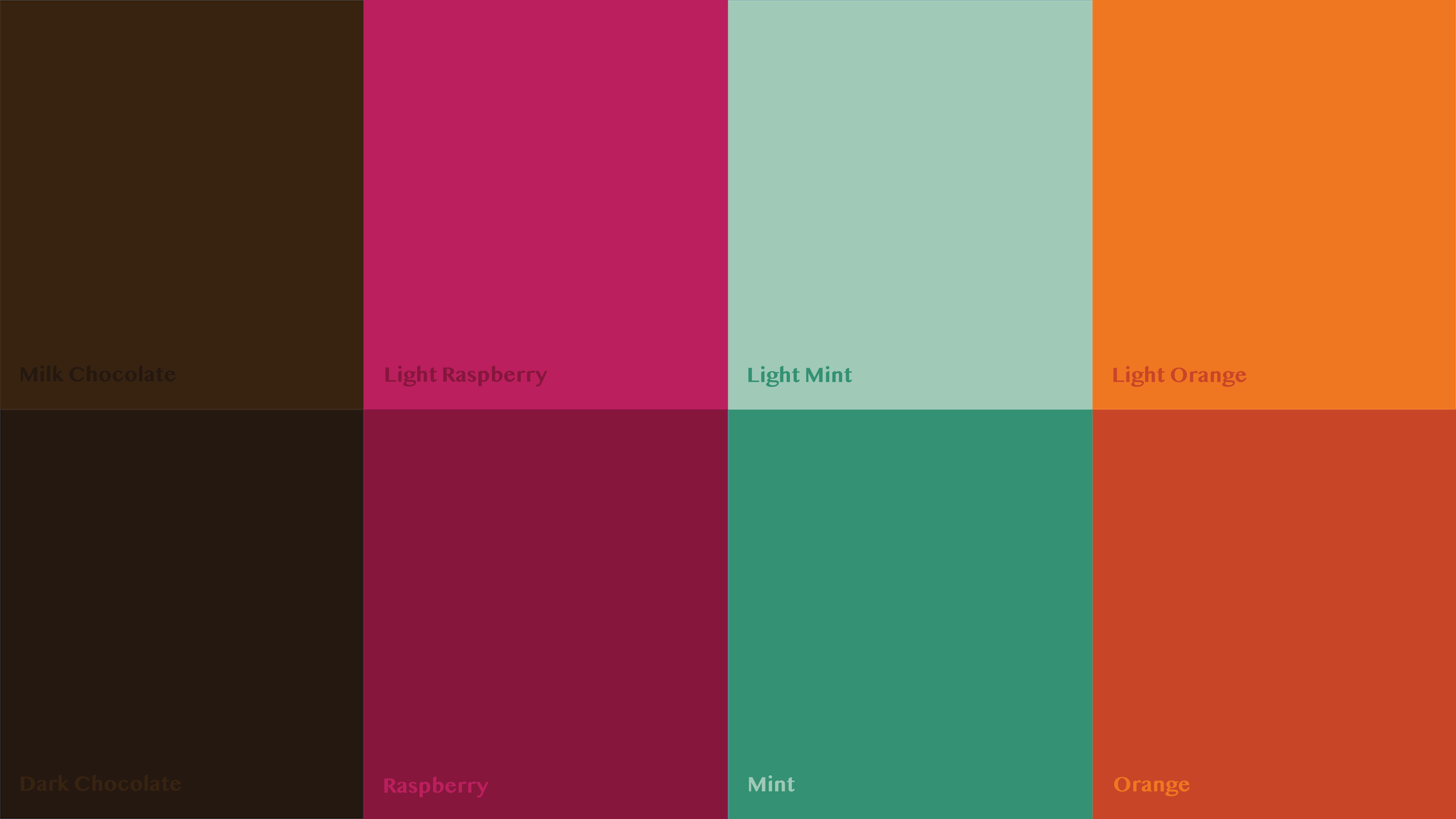
Colour Palette: The colour palette pairs two tones for each flavour, using lighter and darker variations of raspberry, mint and orange alongside milk and dark chocolate browns. This creates contrast within each colour pairing while keeping the flavours visually distinct. The brighter shades bring vibrancy and energy, while the deeper tones add richness and indulgence, striking a balance between the brand's playful personality and premium positioning.
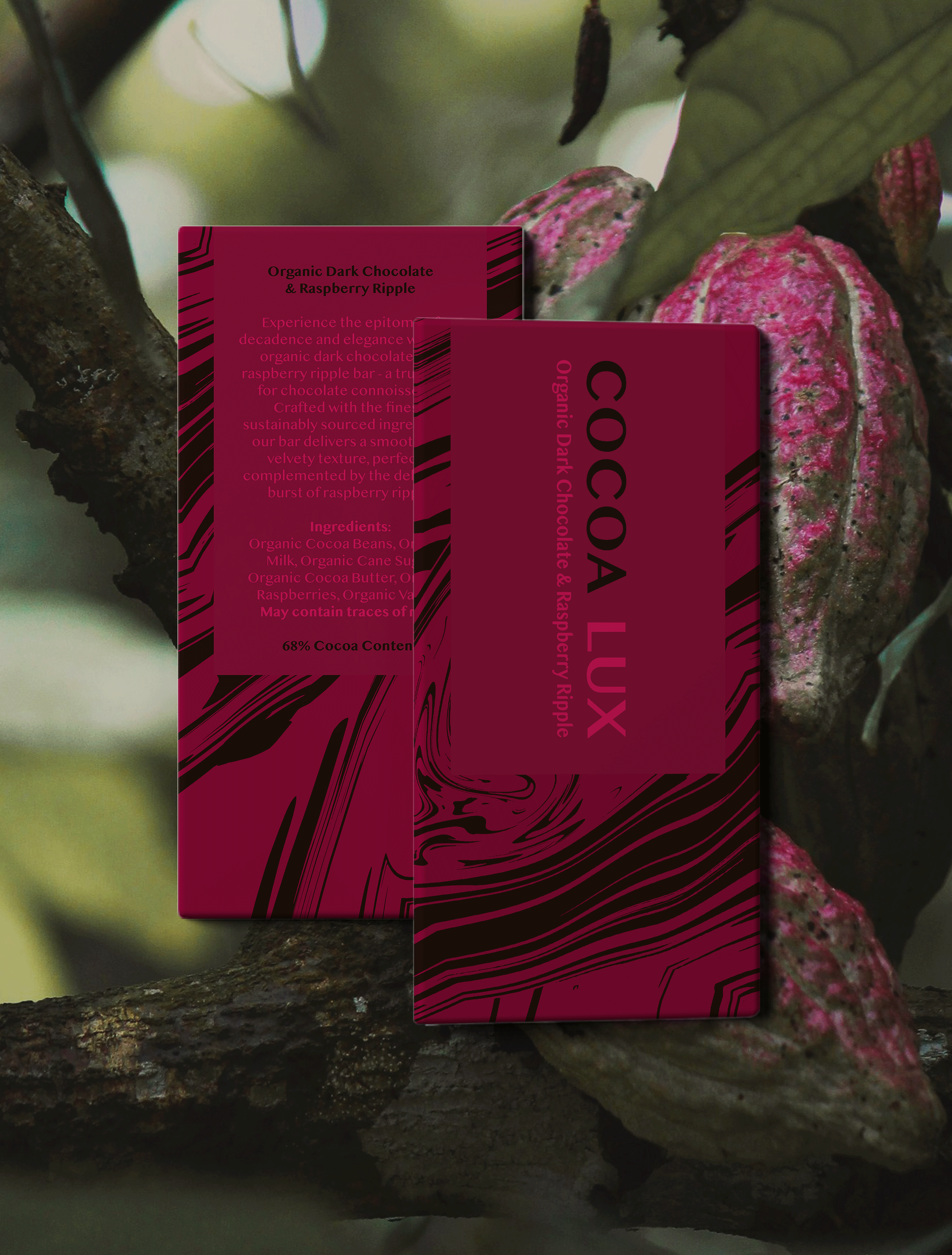
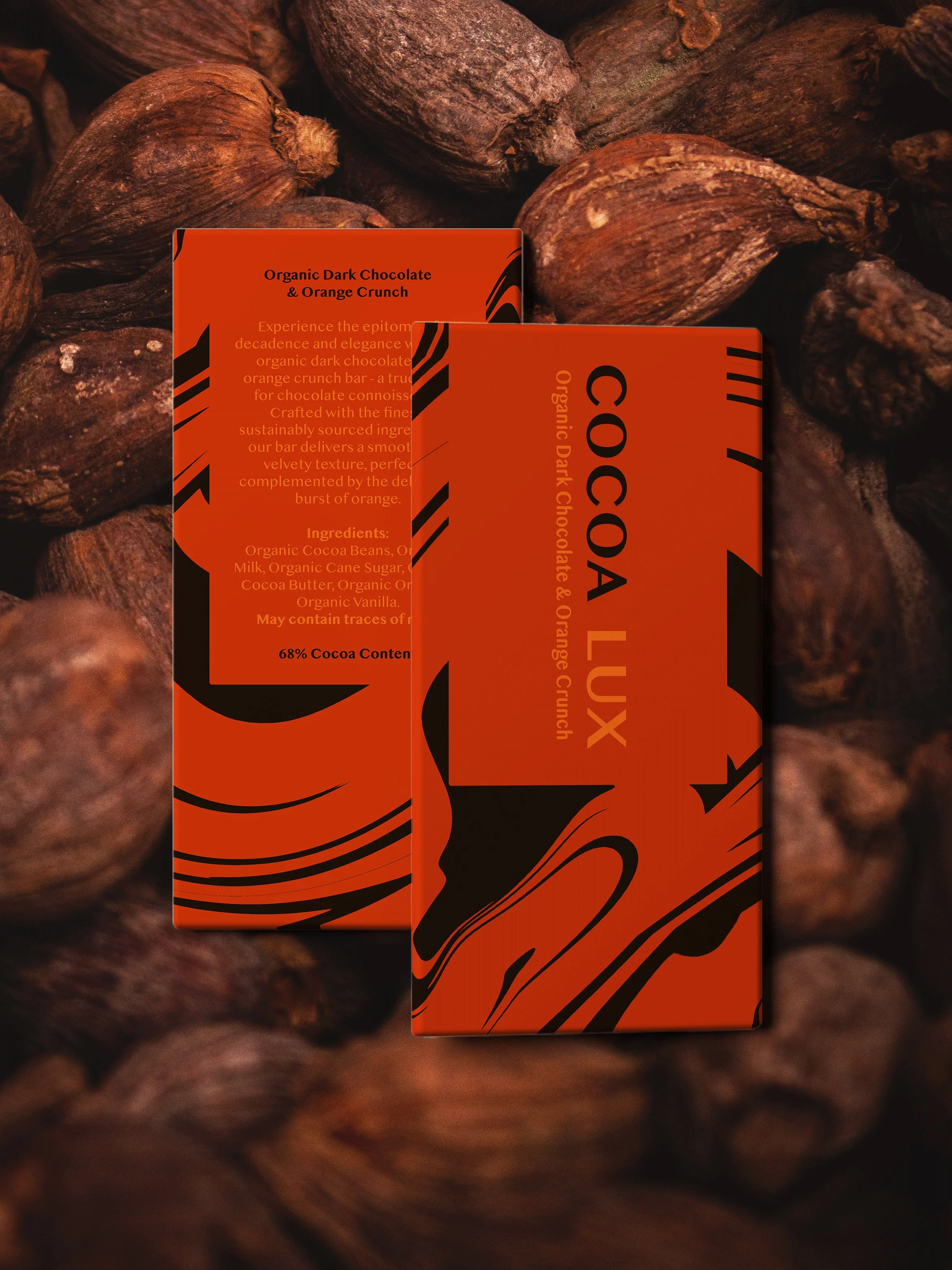
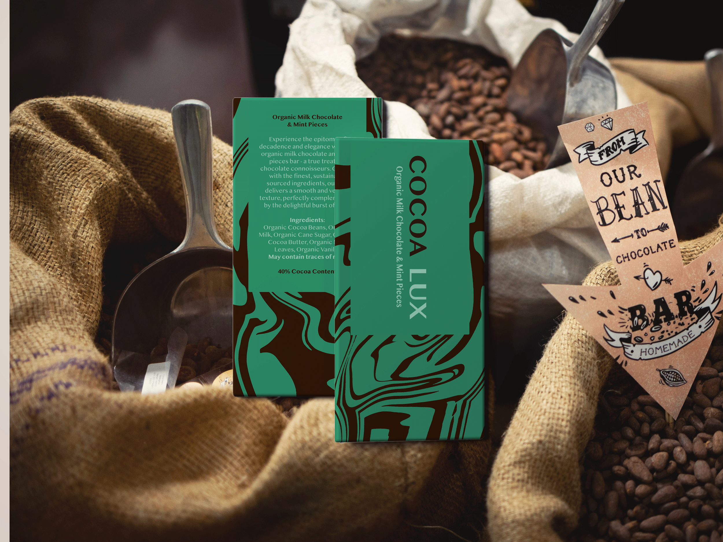
Packaging Design: An abstract pattern inspired by the fluid, organic movement of melted chocolate creates a distinctive visual identity across the packaging. A bold, contrasting colour palette brings each flavour to life, with colours that ripple through the chocolate inspired patterns to reflect the ingredients within. The combination of expressive graphics and striking colourways creates strong shelf appeal, helping Cocoa Lux stand out in a competitive market while maintaining a cohesive look across the range